Churchcrawling in New York City
/Thinking about traveling to New York, churches are not the first destinations that come to mind even though by default "churchcrawling" is my primary activity when traveling. But of course they are there, especially for someone interested in Gothic Revival Architecture.
I have posted my complete flickr collection, but this post will feature a few favorite images from the trip with some reflections on the buildings visited. This is actually a fairly unusual post for this blog to have this much personal reactions to visiting churches. But perhaps this will be good, since I usually dodge questions for which the following would be an answer.
Trinity Church, Wall Street
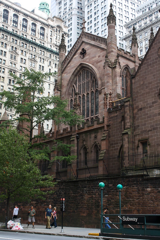
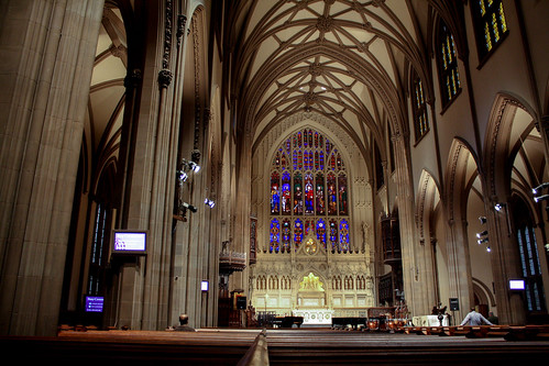
Trinity Church, Wall Street Manhattan, New York, US Episcopal (ECUSA) Richard Upjohn, Architect completed 1846
One of the first Gothic Revival churches in America with a direct lineage from the English Victorian Gothic Revival, and one of the best. The flat (liturgical) east end is particularly effective and distinctive. This church went a long way toward establishing the Gothic as a fashion across all denominations.
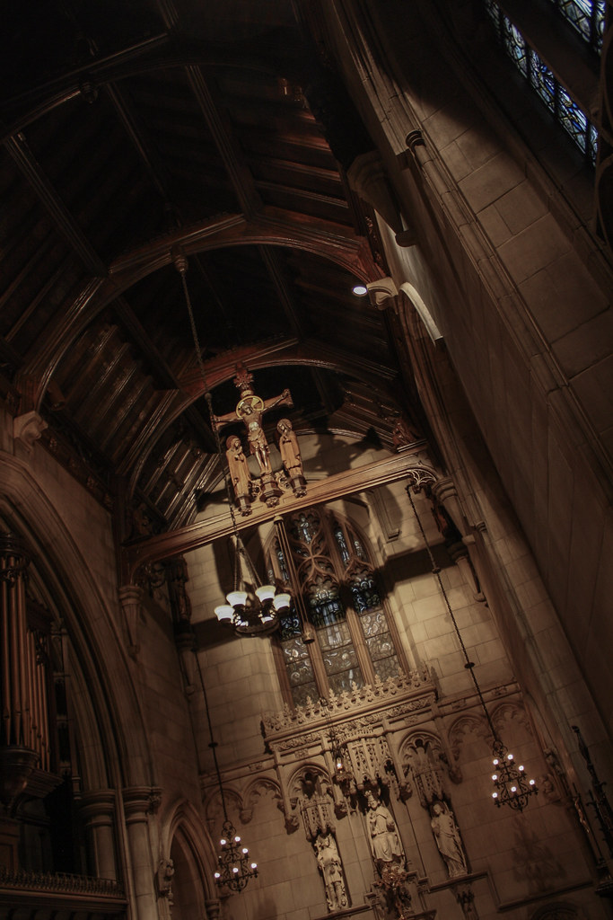
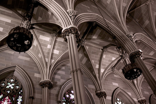
The All Saints Chapel, just to the north (stage left) of the chancel was one of my favorite spaces of the trip. It reinforced that Gothic wants to be tall and dark. (And handsome?) The richness of the material compared to the painted ribs and plaster of the nave makes all the difference. While the familiar vast splendor of the high Gothic cathedrals is impressive, there is a very different richness in this chapel.
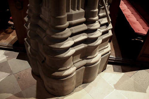
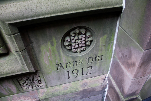
This foundation cornerstone, for an attached building not the main church, will be the first example of some really wonderful inscriptions.
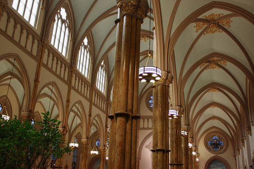
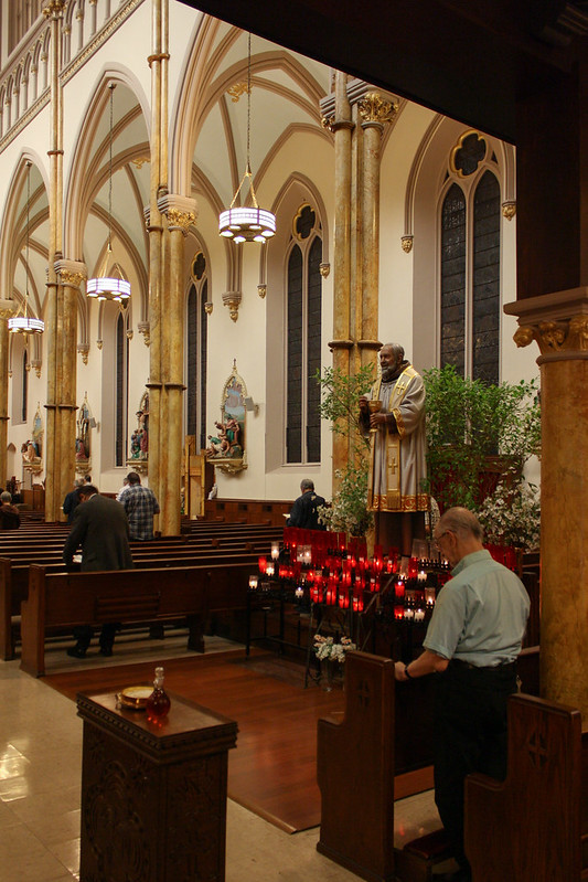
Old St Patrick Cathedral Basilica, New York
Old St Patrick Catedral Basilica, New York Manhattan, New York, US Roman Catholic Joseph-François Mangin, Architect 1809-1815; 1866
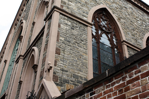
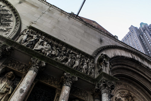
From the exterior, this basilica is a very strange building; the wide single gable does not correspond to the overtly Gothic elements. The blank front (the photo above is the rear) painted in the pinkish color of the trim above has no formal connection to the rest of the building or to known modes of Gothic fronts.
Turns out the 1809-1815 building was Neoclassical and it was redone after a fire partially destroyed the church in 1866. Given this was twenty years after Trinty church (above) and coincident with the new St Patrick Cathedral, the Gothic retrofit must have been a matter of keeping up with prevailing building trends and changes in relevant bearers of meaning.
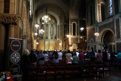
Despite being counter to the essential construction and proportions, the interior is relatively effective. Though a quick comparison of the interior wall surface and the exterior stone makes the artifice woefully apparent.
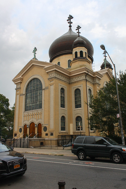
Transfiguration of Our Lord Cathedral, Brooklyn
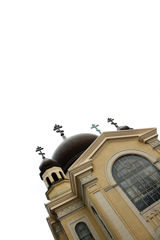
Transfiguration of Our Lord Cathedral, Brooklyn Williamsburg, Brooklyn, New York, US Russian Orthodox Louis Allmendiger, Architect 1916-1921
Unfortunately, the church was locked when I visited.
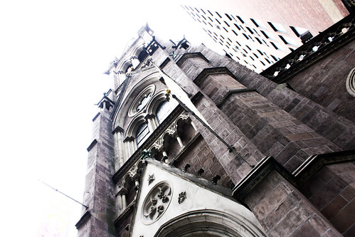
St John the Baptist, Manhattan
St John the Baptist, Manhattan Manhattan, New York, US Roman Catholic (Capuchin) Napoleon Le Brun, Architect 1871-1872
One of the many Gothic Revival parish churches throughout the city. This is the central tower front version.
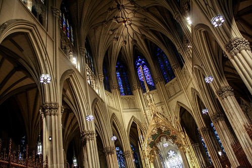
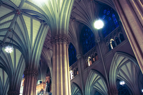
St Patrick Cathedral, New York
St Patrick Cathedral, New York Manhattan, New York, US Roman Catholic James Renwick, Architect 1858-1878
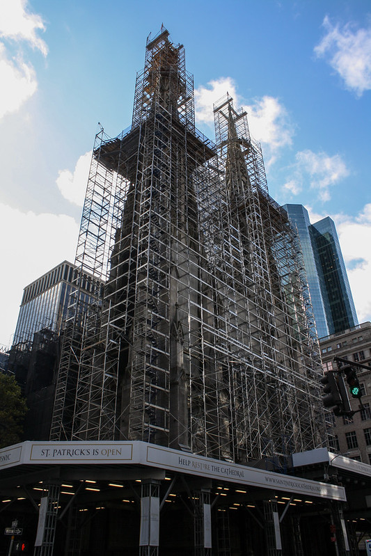
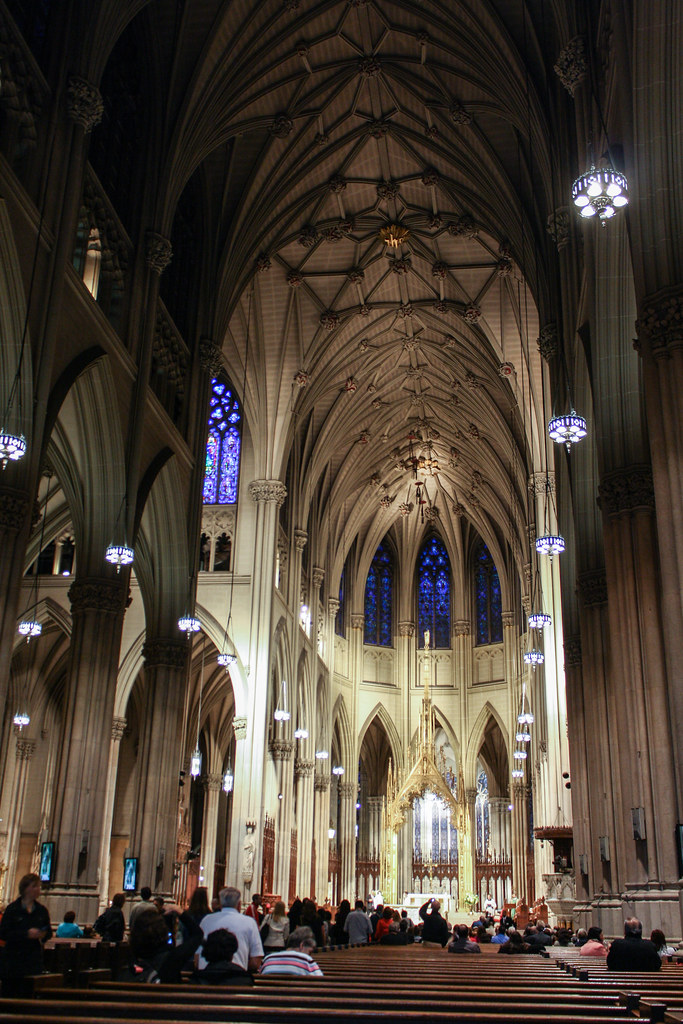
A restoration project is well under way, with the recently completed scaffolding on the exterior. The scaffolding blocked most of the light to the nave windows, unfortunately.
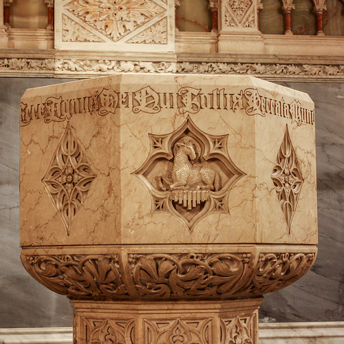
Hey look! A beautiful font on a beautiful font!
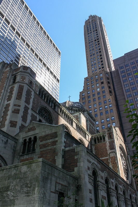
St Bartholomew, New York
St Bartholomew, New York Manhattan, New York, US Episcopal Bertram Goodhue, Architect Stanford White, Architect (portal & narthex) 1916-1930
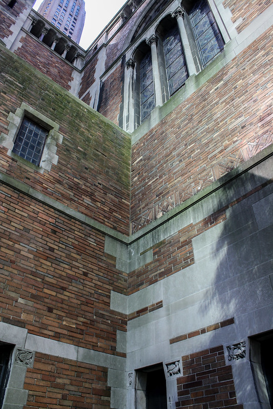
This was the surprise of the trip. I was only vaguely familiar with the aerial exterior views of this church before, which did not do justice to the intricacy of the compositions inside and out. This type of combination of stone and brick rarely works well, but here it is exquisite. The stone edges are more unified and the transitions strike an ideal balance of irregularity. The texture of the brick, with some moments of irregular placement as well, better harmonize with the stone. And the lovely patina of weathering adds considerably to the effect.
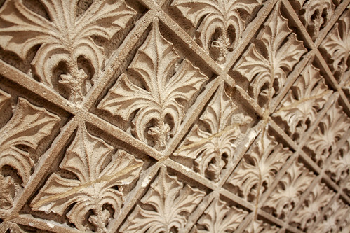
The intentionality and ubiquity of the carvings allow relatively small figural elements to harmonize with the whole of the building. This is an excellent lesson for when tastes and/or budgets limit sculptural programs.
The front portico comes from an older iteration of the church, designed by Stanford White (of McKim Mead and White).
I found another example of an exquisite inscription on the massive (and oddly conversational) cornerstone. Inscriptions abound all over the church. See the entablature (frieze?) above and the capitals below.
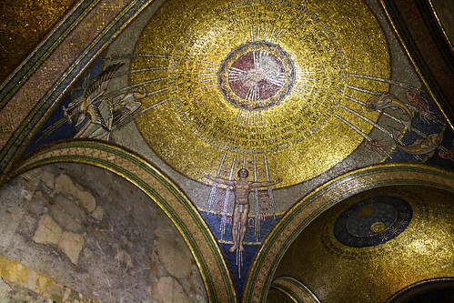
With increasing frequency, I find the churches which evoke the greatest response tend to have been described in some way as "Byzantine." This is not only a matter of ornament or revivalist style differences as this description has been given for the self-consciously abstract churches.
Part of the Byzantine character (using the term in a very empirical/phenomenological sense, not a strictly art history sense) is the roughness or rawness of the materials, even in fine mosaics, which pairs perfectly with the figural abstraction. Mosaics are only part of a larger emphasis on texture, whether that be patterns of simply material texture. Byzantine art has a degree of abstraction ideal for Christian sacred art, one which we have returned to throughout history. (For example, consider Eric Gill's stations at Westminster Cathedral, which I love. Or the illustrations in the Liturgical Press' editions of the Roman Catholic Missal, which are indicative of sacred illustration for the past 50+ years.) Darkness accompanies the roughness and abstraction. Light only has meaning in the context and contrast of darkness.
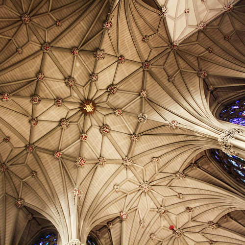
But ultimately I think it is something more primal, and I'm going to side with Dom Han van der Laan and say that it comes from the thickness of the wall and its relationship to the space. Gothic architecture, like St Patrick, is surface architecture; Byzantine, like St Bartholomew, is wall architecture. Contemporary design tends to prefer phenomenal transparency and modern technology allows for cheap thin assemblies. Perhaps that is why I find so many contemporary churches bland, thin and sterile.
Give me heavy, rough, dark, unfinished, textured, and weathered.
St Francis Xavier Cabrini Shrine, New York
St Francis Xavier Cabrini Shrine, Mother Cabrini High School Washington Heights, Manhattan, New York, US Roman Catholic (Missionary Sisters of the Sacred Heart of Jesus) De Sina & Pellegrino, Architect 1959
Right outside the subway stop for the cloisters sits Mother Cabrini High School, whose chapel is a shine housing the saint's remains.
The parti of the chapel is what Rudolph Schwarz (the first to draw such a plan) called a "dark chalice," a parabolic plan with the sanctuary in the apex. Schwarz initially said this was not a plan he intended to be built, though he himself built one later. It was a response to the problem of material focal objects in Christian churches. The continuous surface which extends, theoretically, ad infinitum, is an abstraction of the ancient symbol of the apse taken to its formal extreme.
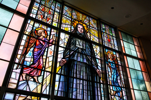
The relatively narrow angle of the arms of the parabola diminish the effect of the dark chalice somewhat. And while the gold(-ish) field of the mosaic furthers the continuity with early Christian apse symbolism, the composition and design of the mosaic figures is disappointing and the inscriptions weak. Furthermore, the color palate (including the stone) is poorly coordinated. In all, it is very much of a kind with the kitsch sold in the gift shop which unfortunately constitues the main street entrance.
The Cloisters
View complete flickr set... (not exactly a church)
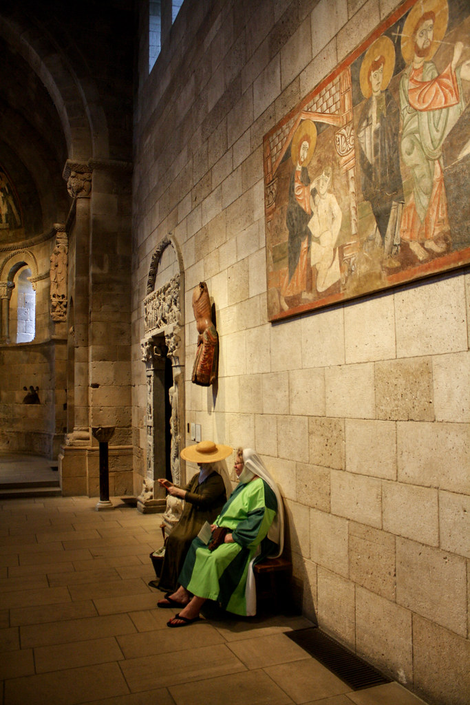
Turns out the day we chose to visit the Cloisters, The Metropolitan Museum of Art's Medieval collection, was renfair day at Fort Tyron. So while it was insanely crowded and not the slow contemplative experience described to me, the (sort of) period clothing was an unexpected bonus.
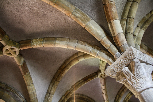
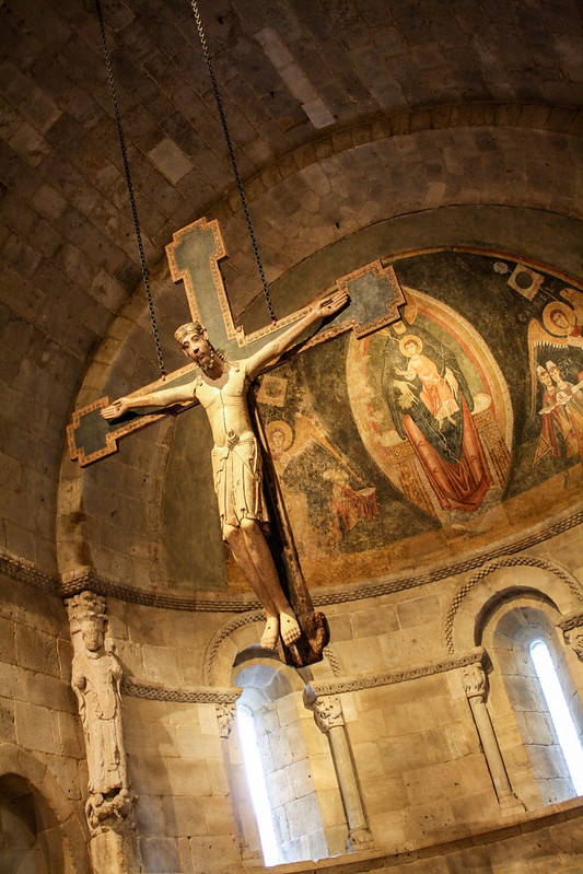
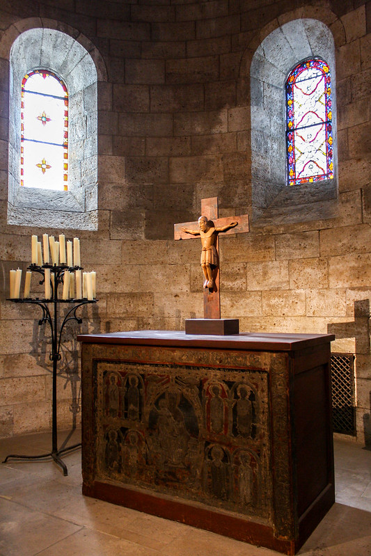
I did not realize going in the degree to which the building is the exhibition. Major pieces of a handful of European monasteries were imported and reassembled into the fabric of the building. Many more smaller elements, especially jambs, give an even more examples of period architecture. Some of these are clear insertions, and some are more subtle. In one chapel the reconstruction matches the original just enough to allow to experience the completed form without obscuring the artifacts or overly faking the reconstruction. A better result could not have been desired (except maybe for the original chapel to still be intact and in use).

