AWN Pugin at 200: Gothic Revival in the 21st Century (Part 1)
/Over on the linkedin Faith & Form discussions, Fr Richard Vosko brought to our attention the 200th birthday (last Thursday) of Augustus Welby Northmore Pugin. He also asks some pertinent questions.
Two thoughts: 1) Why might there be interest in a Gothic Revival revival? 2) What could be said about architectural style and it appropriateness for 21st century worship patterns? Pugin, himself, once wrote that the design [of a church] should fit the purpose of the building and that it should be obvious to all.
We'll spend more time with Pugin on these pages in the coming year in honor of his 200th birthday, but to start I would like to contribute some thoughts to Fr Vosko's prompts. Which means that the first in a series of posts deals with the subject's legacy. Surely bloggers are allowed that type of indiscretion.
This part (Part 1) will present a few observations from churches recently built in the manner of Gothic Revival (that is, gothic language when used as a conscious stylistic choice after it ceased to be the default method of building). It will then turn to some lessons for doing it better gleaned from the churches built by the generation immediately following Pugin.
We have added a bit of perversion to this notion that a church should be self-evidently a church, particularly when used as an argument for traditional buildings. It comes from the most superficial reading of Pugin, a reading that puts appearance before cause. It is the distinctly post-modern perversion of gothic-ness allowed to stand in as a symbol for church-iness. As a style, the gothic is perhaps the most susceptible to this because it is so evocative in image and literature.
There is still some truth to the assertion that when asked to envision a church many people will picture something vaguely gothic. And there is some strength in the continuity of that association. But the fault arises in thinking that the appearance of gothic as a style will suffice to signify "church."
The worst cases have but a few characteristic details applied to an unrelated structure. The result is rather uninspired, overly-simplified buildings that are but caricatures of themselves. There are many examples of this, but the failed proportion, density, and craft of Our Lady of Atonement, San Antonio is one of the most extreme.
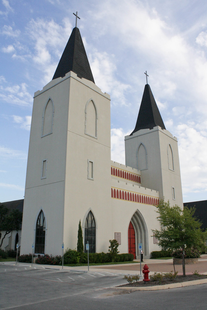
The derisive label of disneyland architecture is tempting to apply, but it is actually inappropriate here. The building lacks the knowing wink of a stage-set dichotomy. Nor does it reach the playful peak of a place such as Charles Moore's Piazza d'Italia. While a church building can certainly be playful (what is ritual but a very special class of play), what it cannot be is thin and superficial.
A second example that is probably more indicative of typical contemporary churches built in imitation of Gothic styles is St Joan of Arc, Phoenix.
This building is less shockingly incongruous, but a number of objections as to the appropriateness of the language remain. There are questions concerning the geographical, cultural, and climactic appropriateness of a style developed in northern Europe for the American southwest. There are questions about the materiality, tectonic, and building technologies involved. But the chief among these gets more to the point of Vosko's question about the style's "appropriateness for 21st century worship patterns" and has to do with the basic spatial form of Gothic churches.
The basilica form is integral to the Gothic. Along with this form come an emphasis on linearity, both in the axial plan and in the characteristic verticality and detailing. This form emphasizes the processional elements of the liturgy as well as a hierarchy of space graduated along the axis. The repeated bays--the structural and spatial division that is its definitive ordering system--also provides a means for dividing the space into distinct zones from the most secular narthex to the most sacred chancel. In addition, the bay structure relates directly to the development of side altars and chapels.
Now take look at the plan of St Joan of Arc from the aerial photo. (I was unable to find a plan or good interior photos, and the church was locked when I visited.) The aerial photo shows the spatial form of the church.
The main volume is square. Square or wide plans have become more desirable due to changes in the perceptions and requirements of worship. Increased importance of seeing and hearing as a measure of participation favors plans that allow greater proximity of each seat to the liturgical focus. Wide spans also support the trend towards larger congregations, particularly in suburban America. So in this one aspect there appears to be significant disconnect between these contemporary trends and the desire for a Gothic style.
It seems parishes desire a horizontal liturgy in a vertical building. The design of St Joan of Arc actually mediates this conundrum fairly well on the exterior massing, if only by reducing the actual Gothic content to mere references. A limited view of the interior suggests that it did not fare so well. Also missing here is the great western front typical of Gothic churches large and small.
These examples seem to be typical of contemporary applications of the Gothic as a style in modern church buildings. They are either poorly-constructed imitations or compromised distorted adaptations.
This is not an argument against deploying Gothic Revival for 21st century worship spaces. This is an argument for doing it well, fully, and worthily. There are arguments beyond Pugin's own to support its continued use and development. I reject outright any argument (including those of Pugin) that any particular style is intrinsic to western Christianity. That said, the value of continuity and the value of the evocativeness of gothic remain.
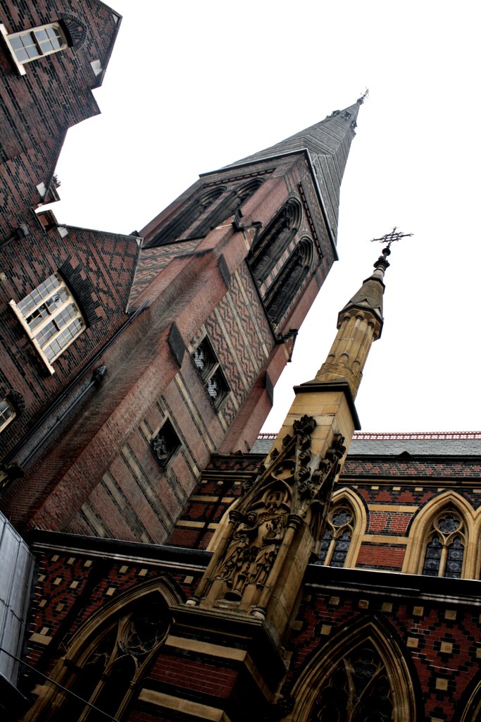
There are a wealth of examples of Gothic revival churches to consider for examples of how to do it well. The work of Pugin himself is an obvious choice, but we will examine his work in later posts. Since we are looking at the legacy of Pugin, it is worth looking at a few buildings from the generation that followed him. This generation includes architects such as William Butterfield, G E Street, and George Gilbert Scott.
Even though these predate contemporary worship patterns, there is already a flexibility with the language that suggests the ability for adaptation without dilution. Whereas Pugin himself was more concerned with particular medieval details, liturgical accoutrements, and their uses, those who followed him explored more their expanded applications. This may be the result of a difference between Pugin's Catholicism and the Anglicanism (though certainly High-Church Anglicanism) of the later designers and/or their projects. But for the purposes of contemporary building, there is much more to learn from this subsequent round of Gothic Revival buildings.
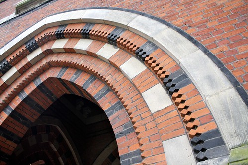
The obvious concession in the buildings shown here is in brick as the dominant material. But this concession is not a liability; it is the defining characteristic of the building. The constraints of current construction practices and church finances significantly limit the realization of such highly-crafted and labor-intensive buildings in the manner of medieval Gothic. So many modern versions seem to apologize for this fact on their very façades with their sparse details and expanses of non-material. Even the type of brickwork seen in the work of Butterfield and Street is now cost-inhibitive for many congregations. But the lesson here is to find substitute materials that carry other appropriate characteristics even if they do not appear to directly mimic the original.
In the case of patterned brickwork, the inspiration does not come directly from the same element of the model buildings. That is, the architects adapted the wall of the new building from the contemporary textiles of the original. It does not hurt that the idea that enclosure developed from textiles (Semper, et al) circulated at about the same time. Parallel to the development of the architectural Gothic Revival, Pugin, Bodley, and others worked to revive medieval vestments, textiles, and other liturgical crafts. I believe this (what we would now call interdisciplinary) pursuit accounts for the complexity of their architectural designs, particularly on the interiors. As an architect it does not suffice to look only at architecture.
The case of the textile patterns themselves constitute a lesson as well. In the cases they are used in contemporary buildings, even when only as highlights, they greatly improve the end result. The sanctuary of St Mary Cathedral, Austin demonstrates this very well; and even the interior of Our Lady of Atonement, San Antonio benefits greatly from rich color and relief patterns on what would otherwise be painted drywall. If you build in the Gothic style, do not fear the Damask and the Brocade. While actually very popular in current vintage-inspired interior designs, architects tend to shy away from this kind of color and pattern. But the more it can be integrated into the building system rather than applied as a surface treatment, the more impact it will have. It also necessitates the introduction of at least some degree of handicraft, which is itself a major theme of the Arts & Crafts movement that grew in part out of Pugin's writings and directly out of G. E. Street's office.
The last striking development in the Victorian Gothic Revival churches is the same property that is one of the great failures of contemporary Gothic buildings: proportion. English Gothic churches, even going back to the early Norfolk parish churches, were less dramatically vertical than the French High-Gothic cathedrals. This is in part a regional variation, since even the great English cathedrals have dominant horizontal elements (as in the linear break in the nave of the Salisbury, despite its unthinkable spire) and unusual horizontal proportions (as in the façade of Wells Cathedral). But is also a necessary adaptation for the reduced scale and less procession-driven liturgical use of the smaller parish church.
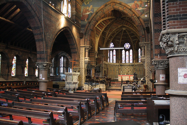
I have not done the full dimensional and proportional analysis to determine why the more squat Victorian churches work while accommodating wider interiors (see St James the Less, Westminster, above) and why so many contemporary examples fail. These observations are based solely on immediate reactions. But whenever a contemporary church built in a specific historical tradition strikes me immediately as off, the proportions are the first offender. Meanwhile, back in Victorian England, this little bit of perfection happened.
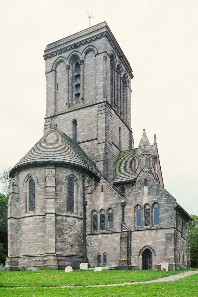
This would never be used in a textbook to illustrate proper Gothic buildings. The tower is too dominant, there is far too much asymmetry, the nave is too fat, the porch shouldn't even be there. But it works incredibly well. Which gives us the final lesson (at least for now) from post-Pugin Victorian Gothic Revival churches: above all, get the proportions and massing correct. And correct here doesn't necessarily mean replicating Sainte-Chapelle and twisting it to fit a large suburban parish or shrinking a cathedral. Proportion is not ultimately about dimensions and ratios, but about the nature of the relationships between the parts and the whole.
In the contemporary examples with which we began, there were not even enough parts to form a proper whole. The result is isolated objects on a field rather than the rich complexity of the source models. Modern architectural sensibilities are certainly to blame for this as well, but then the Cistercian monasteries with their isolated details and sublime silence suggest that even this can be satisfied. We just simply aren't doing it well.
This must conclude Part 1 of this series. Part 2, which I edited out since this has gone on far longer than anyone will read a blog, will address the "contemporary worship pattern" element of Vosko's prompt. It will consider how a Gothic building might suit and serve two dramatically different liturgies.


