McGill Chapel
/It has been some time since I have been able to go churchcrawling. But after a Memorial Day trip to the nearby splashpad with the girls, I had the opportunity to look in on the new chapel at the St Andrew's Episcopal School Lower and Middle School Campus. View the entire photo set on Flickr.
The school dedicated the chapel on Dedicated 01 May 2012. The architects were STG Design (the same firm who designed St John Neumann, Austin) and the landscape was the work of TexaScapes and TBG.
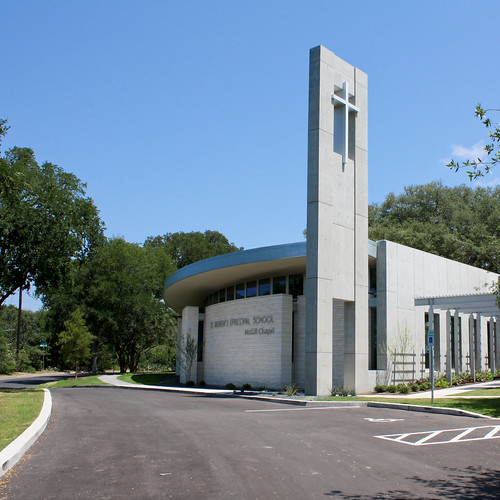
The design of the exterior is highly refined, especially in its relationship to the campus. It is clear that site considerations dominated the design process from the curve on the west and south wall following the road to the open north wall facing the campus interior.
A dramatic concrete tower marks the chapel on its public face. The school already has a functioning bell tower, so this one is purely emblematic. And it is effective. Driving from the northwest and looking for the chapel, I suspected that this was it from the quality of the architecture in the absence of obvious iconography; turning the corner, the tower confirmed my assumption.
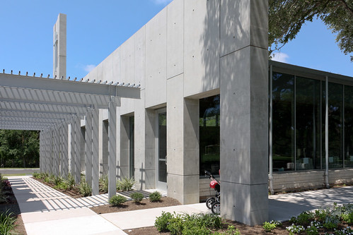
Separating the new chapel from an adjacent existing classroom building, a trellis connects the public face and driveway to the interior face. Highly finished architectural concrete, absent from the rest of the project, defines this space and connects it to the tower.
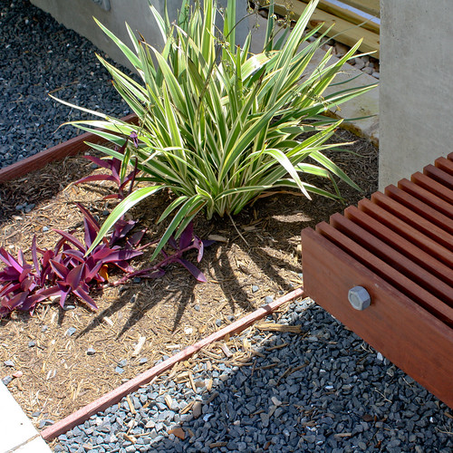
An ordered landscape accompanies the geometric formalism of this space. Benches line the passage.
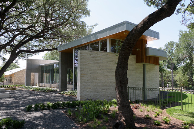
Passing through this corridor, the character changes completely. You are now standing in a less-formal grove of oak trees faced by the fully-glazed north wall. The new sports fields, which occupy the open core of the campus, open up before you. The entrance is located at the far end of the grove.
The chapel's somewhat remote location on campus is offset by the effectiveness of the openness of the north wall. Combined they impart a prominence and integration more typically achieved through central location and formally structured
St. Andrew’s 31st street Chaplain Ashley Brandon described the effect:
“One of my favorite things about the new chapel is the way it feels like a sacred space, set apart from the rest of the world, and at the same time feels so connected to the rest of campus, as though there are no walls separating it from the life of the school. The clear windows along the back walls of the chapel are like stained glass, colored with the activity of our community and the beauty of creation. It truly is an expression of what lies at the heart of St. Andrew's. Our transition into the new space has felt so natural, and already we have experienced the added ease and beauty in chapel.”
In contrast to the fruitful complexity of the exterior and landscape, the interior leaves much to be desired. [The doors were locked during my visit, though the extensive windows allowed a good view of the interior.] The north glazing must give a great quality of light further, dappled by the dense oak canopy. But in all other aspects, most notably the liturgical functions, the interior is no more than a decent school assembly hall.
The sanctity of the function demands greater care. I am not saying this with any pre-conceived expectations of what the interior should be (i.e. more traditional or more sculpturally expressive). It is more that there is a noticeable discrepancy in the quality of design between the interior and exterior. Perhaps this is a symptom of so heavily a site-driven design. Function need not be the primary form generator, but it cannot be so explicitly an afterthought when the function is sacred in nature.


