Two Dallas Chapels
/While in Dallas last week on a production shoot for the day job, I had the opportunity to visit two excellent chapels. Both are special elements of larger campuses. The first, the Interfaith Peace Chapel is the first component of a larger master plan for the UCC Cathedral of Hope. The second, the Church of the Incarnation, is the campus chapel for the Roman Catholic University of Dallas. Although the two buildings are very different, both exhibit the cohesive attention to detail common to chapels and rare in larger churches.
Interfaith Peace Chapel, Cathedral of Hope
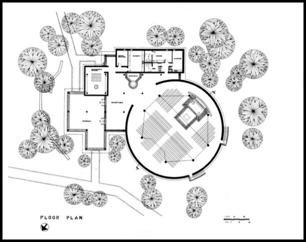
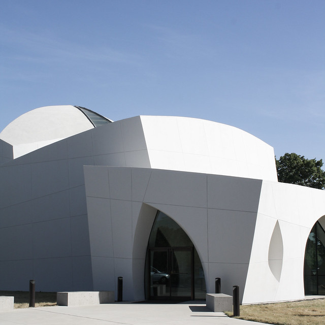
The highly sculptural Interfaith Peace Chapel is the first completed element of Philip Johnson's master plan for the Cathedral of Hope, Dallas. This was one of the last designs completed by Philip Johnson (who also designed St Basil, University of St Thomas, Houston and the former Crystal Cathedral, Garden Grove, California) before his death in 2005.
A model of the complete master plan resides on the lower level of the chapel (see image below). The chapel is just to the right of the planned main church; this gives a good sense of the scale of the design.
From the exterior, the composition of three volumes has been expertly scultpted and considered from every angle. Moreover, the finer details of the openenings and even the expansion joints work perfectly with the volumes to break down the scale and further emphasize the large radius curves which unify the design.
Overall, the exterior strikes a subtle balance between the minimal simplicity of pure white forms with more organic influences.
On the interior, the narthex largely continues the forms of the exterior, while the main space of the chapel is more subdued and fully enclosed.
The primary chapel space combines the the middle volume (nave) with the tallest volume over the stage/sanctuary. Here the gradient and texture of light across the concave interior surfaces take over from the linear pattern of the exterior.
Of the many interfaith chapels and other non-specifically spiritual spaces which attempt to create this type of potent emptiness, this one is particularly effective. The gentle concavity here is enough to mark the space as special and sacred, but subtle enough to not be excessively dramatic.
The sanctuary skylight is a nice variation on a theme (concealed occulus) which serves its purpose to illuminate the sanctuary volume and provide the contrast between the two joined spaces. Naturally illuminated tower volume provides a contrasting destination for the spiritual aspirations gathered in the body of the chapel.
The non-linear (but notably still hierarchical) plan accommodates a variety of arrangements. While a wide linear arrangement towards the stage would seem to be the default, the perpendicular arrangement in place when I visited created an ideal lecture configuration. A circular arrangement would be an equally perfectly suited to the space.
For a space whose purpose is to host a wide variety of events from different religions with diverse architectural traditions, the ability of the space to correlate to different arrangements is invaluable. Accomodations of this nature always loose the material specificity of religious traditions and my not fully function for worship. But that is not the intent of this chapel; when realized to their full potential, such spaces highlight the fundamental inhabitational experiences common to the many traditions.
Church of the Incarnation, University of Dallas
The second building has much of the same admirable thoroughness of detailed consideration, albeit in a markedly different language and in service of a different function. To me it is the more impressive of the two because the consistency and rigor often seen in chapels is more difficult to achieve in a full church. This building has the scale and nearly the function of a parish church; in fact the Diocese changed its designation from "chapel" to "church" after its completion.
The design is the work of Landry & Landry of the Liturgical Design Consultancy in Dallas.
The main body of the church is very similar to a church in south Austin which I think of as the more typical and less effective version of this plan. They both feature a geometric enclosing outer wall with a polyganal inner ring of columns. The sanctuary is integral, not central, with radiating seating. Both have exposed brick throughout the interior and a simple wall opening between nave and narthex.
But two significant design decisions at the Church of the Incarnation make all the difference in the effectiveness of the plan and arrangement: the spatial completion of the plan and the relationship of the nave + sanctuary to the other functions.
This pattern is very much a plan-based conception of a church, which is fairly characteristic of liturgical architecture thinking throughout the later half of the 20th century. As such, it does not have a clear spatial completion as does a volumetrically-concieved building. The form and disposition of the roof becomes critical. You will more typically see a pyramidal or cone-based form over a polygonal church; these work well on smaller buildings (see early baptistries and sepulchres), but do not translate favorably to the scale required of a parish church. The result tends to the dramatic.
The solution at the Church of the Incarnation is a more sophisticated manipulation of solid geometries. Relying on the columns to define the roof, rather than the perimeter, the roof reinforces the aisle while providing a simpler structure. The north facing lites in the parallel surfaces created by the stepped roof provide significant illumination to the interior (note that in these photos the only atificial lighting comes from the station spotlights).
Finally, by stepping the volume upwards towards the sanctuary, this roof also superimposes linear hierarchy over radial gathering. In doing so, it attempts a unification of two oft-confilicting notions of the definition + identity of church. I believe that is the highest and best use of spatial symbolism in modern church architecture.
The integration of the nave to the church's ancillary functions, chapels and entrance is also markedly better than churches like St Catherine of Siena, Austin where the interstitial spaces are clearly afterthoughts. Really it is not integration so much as the superimposition of two spatial models.

A grid of columns organizes all of the spaces outside the nave. This means that no element needs to be created ex nihlio. Both the baptistry and the eucharistic chapel occur within their own unit defined by four columns. In the case of the eucharist chapel this is enclosed by walls, the baptistry against a single wall. All of the solid walls defer to and slide past the columns.
The entry is a thin glass wall in the plane of the columns to emphasize the continuity of space from the the outer portico to the inner narthex, through the ancillary functions and into the main church. Meanwhile the field of columns (and the entry sequence they facilitate) provide separation and hierarchy.

The grid then nests into the simple radial geometry of the nave hinged on one column placed in the perimeter of the enclosing circular wall. The height and openness of the nave balances the low field of columns and walls.
The well-coordinated art program could merit its own discussion as well.


