Schenectady's Grotesque Grotesques
/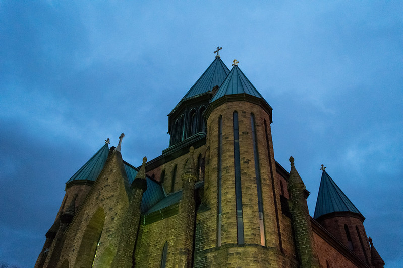
While traveling during the holidays I visited a fascinating (and slightly disturbing) church in Schenectady. Completed in 1899, St John the Evangelist, in the Union Street Historic District (NHRP), is the result of a collaboration between the pastor and architect. The pastor, Monsignor John L. Reilly, outlined the design of the church from inspiration collected while traveling in Europe. Many American churches have been inspired by their pastors' European grand tour, but the end result in this case is not the obvious replica that resulted in the vast majority.
The "supervising architect" (as he is credited in multiple accounts) was Edward Loth, an architect from Troy. This is the most dramatic and unusual of his church designs. Loth also designed a number of churches in the towns around Albany, including my parent's current church in Ballston Spa and St Patrick, Watervliet which was torn down in 2013. Loth studied in Germany, and I wish I knew where and with whom. I would also love to know what specific examples Monsignor Reilly saw and which ones he referenced in the design.
I visited for an evening mass on a cold overcast day as the sun was setting and with the streetlights and exterior lighting on, the lights made for some interestingly lit and colored, if grainy, photos.
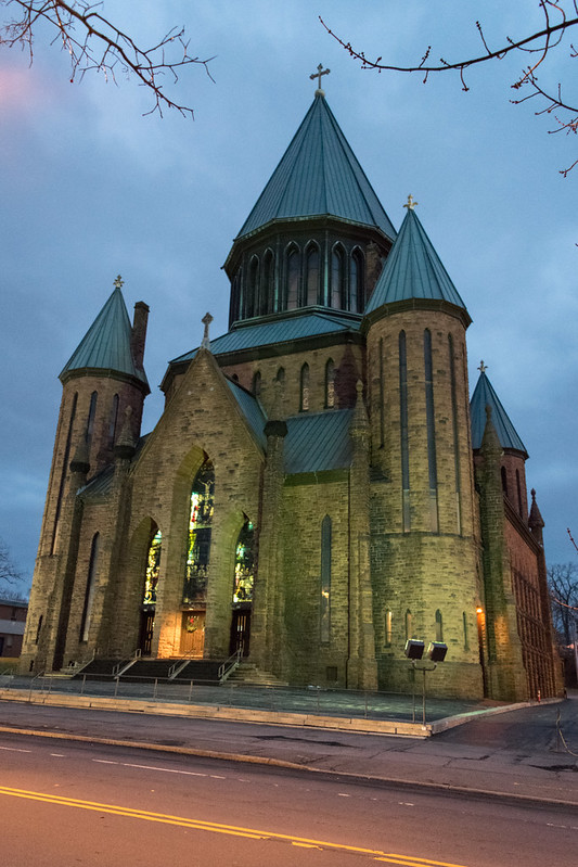
Then as I flew out of the Albany airport, I saw it again. It was hard to miss the dramatic verticality of its presence in the urban fabric.
The axis mundi drew my eye immediately, even before I realized what town we were flying over. It has a similar impact diving up to it.
The striking monumentality and the geometric composition of the building were some of the reasons I wanted to see this church. Another reason was the seating on the interior, with its steeply raked main floor below a circular balcony of more than 180 degrees. Naves based on auditorium seating and balconies are common features of American churches in the late 19th century, but both are rare features among Catholic churches. But even among the auditorium-type churches, the densely stacked configuration inside a square tower is very unusual.
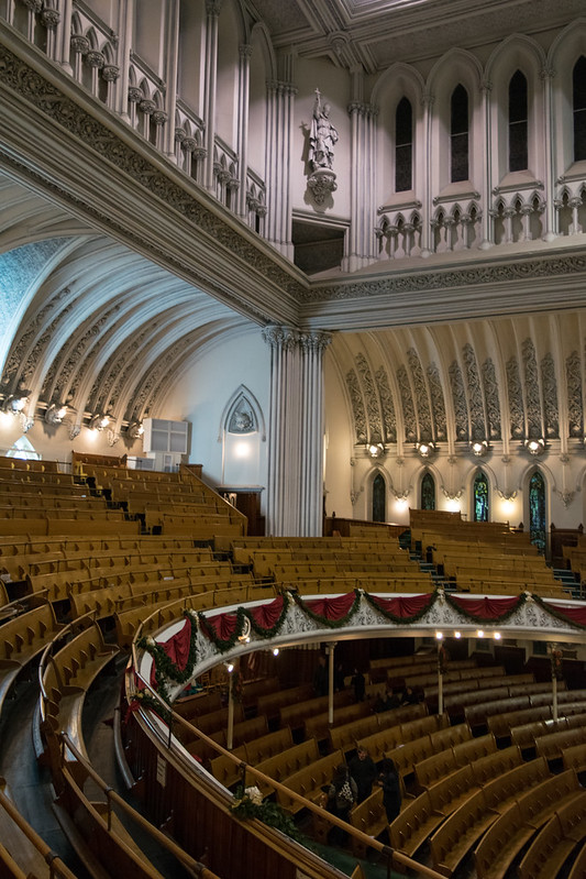
Unusual among auditorium churches, too, is the configuration of what stands in for the "stage." Since the majority of these churches were for spoken word-centric celebrations, the focal point was generally a raised dais with a pulpit. But here, the focal wall is an elaborately developed tripartite wall of altar apses. The openness of the central apse, its interlocking composition with the circular balcony, and the boolean formation of the volumes combine to strike an easily legible balance between the unity of the interior space and the hierarchy of the liturgical components. Compared to the more typical contemporary basilicas, including those designed by Edward Loth such as in St Mary, Ballston Spa, celebration at the high altar is extremely immanent without losing its dignity and distinction. My sense is that the apse and altar here results in a posture more appropriate to the Tridentine liturgy.
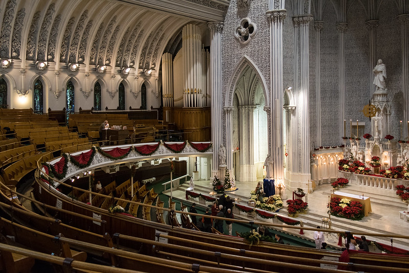
Of course now we have the two-part altar with the high altar as a principally decorative function and the altar of sacrifice free-standing in front. It is a necessary adaptation both for celebration versus populum, when appropriate, and for churches which were designed such that the rubrics of the Rite of Consecration could not be followed to the letter. In the Rite in the 1895 Pontificale Romanum—which was in effect for the consecration of this church, assuming it had made it over and been put in use locally—the Bishop sprinkles the altar while circling it (circuit altare) and sprinkles the church "starting behind the main altar" (incipiens retro altare majus). I do not have the text of the 1596 Pontificale, but I understand it gives the same instructions.
This arrangement should never be designed for new churches, but does not need to be a regretted adaptation. This is a perfect case where it could be an effective arrangement, if only the forward altar of sacrifice were treated with due dignity and give stature appropriate not only to its function but also to the scale of its sanctuary. This is true of both the Extraordinary and current forms of the liturgy and for the celebrant standing both toward the apse and toward the nave.
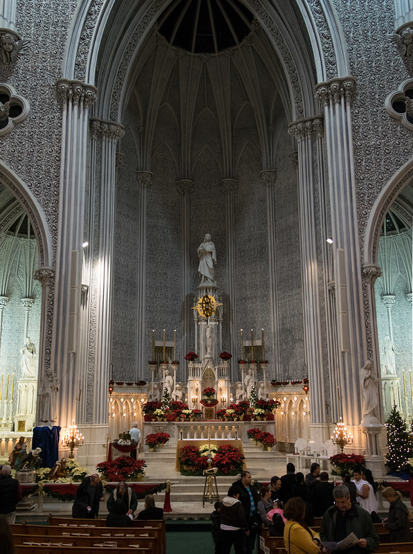
The composition of the focal wall gives a clear hierarchy between the high altar and the two side altars while achieving a balance between the elevation and integration both proper to the sanctuary. At the same time, there remains something slightly off about the whole that I can't quite identify, but that may just be the fact that it is unfamiliar or overflow from the issues with the ornament. Unfortunately, the current usage does not retain the clarity of the composition; there were a number of oddities that reflected a disappointing attitude of apathy in the celebration that did not live up to the nature of the liturgy or reflect the intriguing structure's attitude toward worship.
The church is extremely "modern" in a number of different senses of the word and with both positive and negative results.
On the positive side we have a sophisticated composition of volumes where space (in its modern conception) is a primary element in the overall design. The exterior prefigures some of the geometric Backsteinexpressionismus, with the obvious difference in material. In particular, it reminds me of the early work of Dominikus Böhm, leading up to the Abdij Sint Benedictusberg (1922).
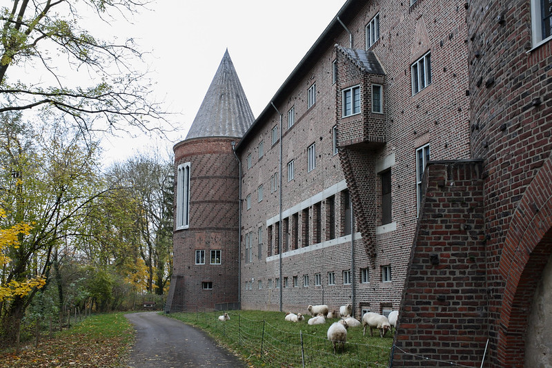
Works such as these highlight continuity of the later architectural developments often characterized with an over-emphasis on rupture and revolution. Something about the proliferation elongated abstractions of gothic windows suggest an active engagement with the precedents not seen in Loth's other designs.
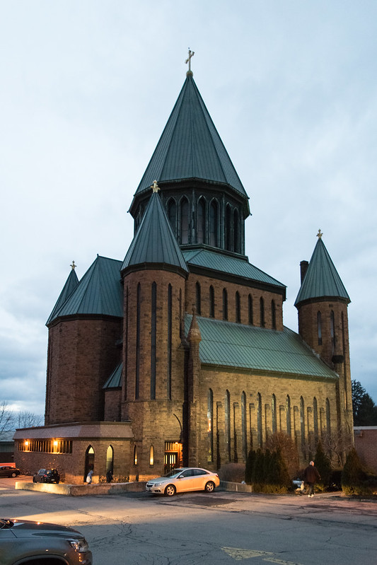
And St John the Evangelist, Schenectady also has a far greater consideration in structure; we see this most notably in the metal and glass dome within the central spire. (Since I visited in the evening, I did not get to experience the effect of that component. There are some good photos on this page, and if I am able to visit in daylight I will add more photos then.)
And the seating arrangement may be classified as modern because of its emphasis on perceptibility of the celebration in the sanctuary. Closed-minded anti-modernist types might reject this arrangement outright, but with the juxtaposition within the more dominant components of the interior there is much more going on here. In person it really does not feel like an auditorium, in the ways that detract from the "higher" forms of Christian worship. The congregant in his or her seat is much more caught up in the milieu of the whole building. Ultimately the arrangement reinforces the clarity of orientation toward the altar.
Though I have mentioned them together, the auditorium style seating is one thing and the balcony quite another. Balconies in general are problematic for participation because they emphasize the posture and spirit of a "spectator" for those sitting there. This is among the least offensive balconies I have seen, mostly on account its integration and imminence, but it still has problems.
The church is also profoundly modern in its separation of its ornament from the structure. The disunion is particularly evident in the interior; and the very fact that it is more evident in the interior reflects a further disjunction between the interior and exterior.
The church exhibits the problematic type of 19th century eclecticism (where complexity does not lead to richness) in its ornament and a tendency towards individualistic sentimentality in its art. The stark whiteness of the whole composition was interesting, especially since I visited in the middle of writing my piece on the Chartres Polychrome Controversy. I guess it imparts something of Wincklemann's "noble simplicity," but that is ultimately annihilated by the sculptural exuberance of it. On the other hand, this formal exuberance is only possible because it is monochromatic.
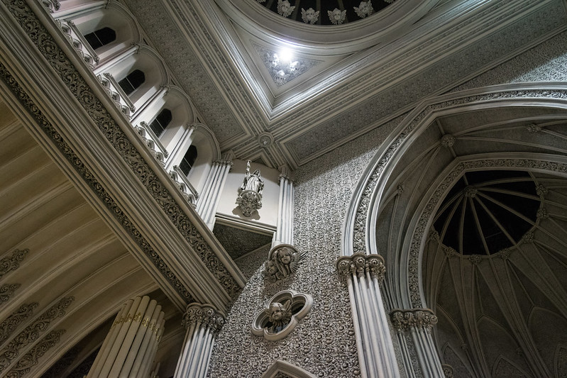
(I'm tempted to do a false color version of one of these photos just to see how ridiculous it would be...)
This is one of the best examples where the ornament is essentially frosting. The clustered columns are clearly false, and only occur as a framing device clearly divorced from any structural function. Note the difference between these and the single slender metal columns supporting the balcony. What is worse, it is all made of poorly constructed plaster with an infill executed in a grotesquely inflated grotesque. The word "grotesque" immediately sprang to my mind and has not departed since. I've since determined that four distinct meanings of "grotesque" apply here. In this case, I mean a "distorted" version of a "fanciful combinations of intertwined forms" that began life as a Roman infill painting technique.
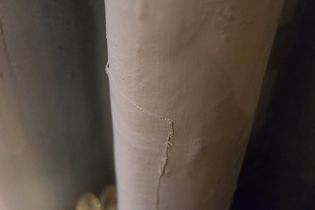
The commitment to the texture is admirable; its ubiquity is unifying. And I wanted it to work. I kept thinking how wonderful it could have been in the hands of someone more skilled in the composition of organic field textures. Someone like Louis Sullivan, who exhibited greater creativity, more sophisticated subtlety, greater variety of scale, a more effective shallow relief, and, of course, generally worked in terra cotta instead of plaster:
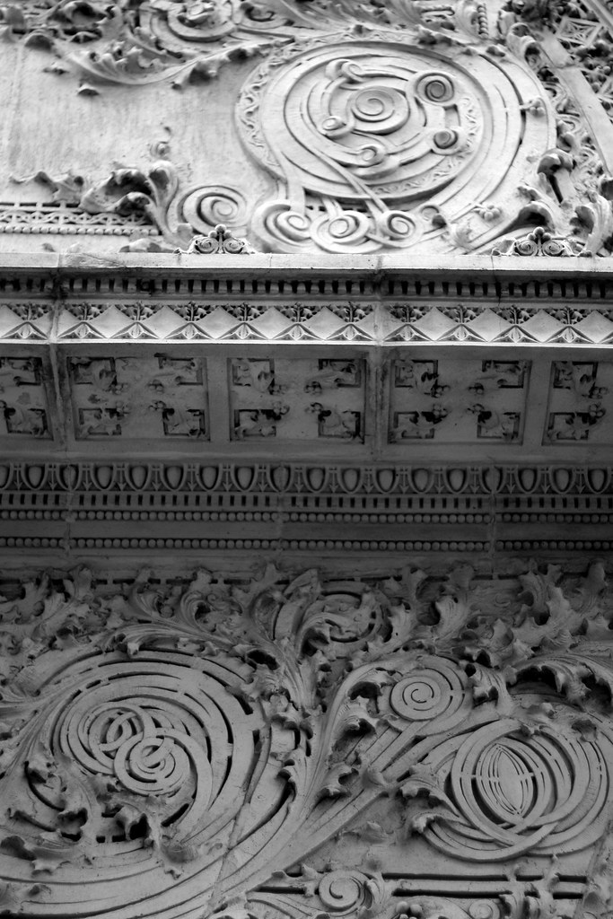
This is something I would like to try to make work even today.
The tendrils in the transepts are much better, since they continue and heighten the rhythm of the actual structure, tie this part of the building to the focal wall, and engage the negative space of the concave ribs.
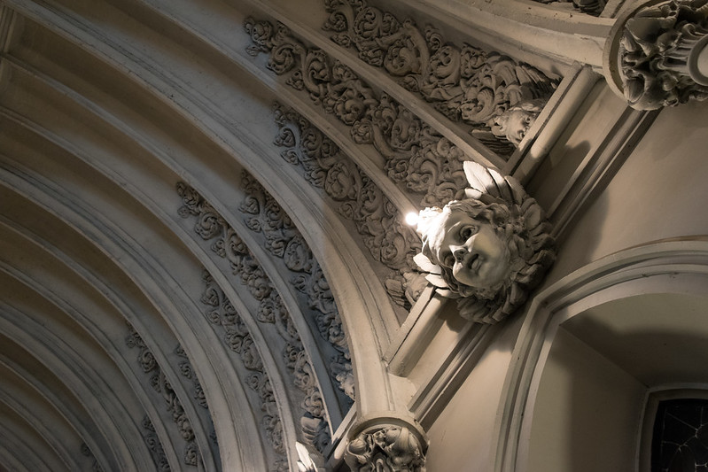
Which brings us to the most ridiculous (and grotesque) part of the whole thing: the grotesque grotesques (using two additional meanings, in the sense of "abnormal and hideous" or "absurdly incongruous" rendition of a "face used as architectural element").
The cherubs.
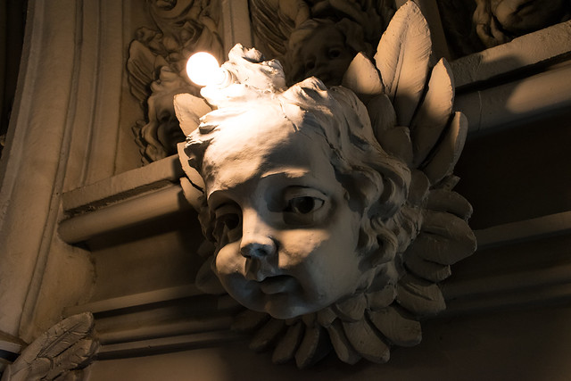
Or more properly, the putti, which are mistakenly called cherubs. The cherubim are awesome beings depicted as multi-winged living creatures attendant to the majesty of God. They originate in Hebrew scriptures and are thus proper to those aspects of Christian worship which cry "Gloria!" and "Alleluia!" and "Sanctus!"
Putti, on the other hand, originate in Classical paganism and come to the fore in Christian art in its lowest and most extravagant period, and more importantly, among the trends that most severed the liturgy from devotion and personal piety. By the late 19th century, any depth that might have existed in their Quattrocento iterations had been reduced to the most pathetic and sentimental. Thus they are two faces of the humanist individualism that is poison to the fullness of Christian worship.
The proliferation of putti—supposedly more than 500—inside St John the Evangelist, Schenectady simply come across as distracting and more than a bit creepy. The intent was most likely to represent the "heavenly host," and childlikeness (not childishness) is certainly an aspect of the Christian ideal; however, the this depiction is of a milksop host and a sentimentally pandering image of an inordinately comforting heaven.
One other item that I would like to investigate further is the electric lights. There are lamps oddly placed in the putti's foreheads and a few in the perimeter of the central apse. Given that Schenectady became the home of both the Edison factory and General Electric in the decades prior to the church's construction, it is possible that they are original, or at least early additions. Their placement seems to be more for effect than for general lighting, which would suggest a different approach to the use of electric lights—one fitting to a city interested in showcasing its technological prominence—than the more utilitarian approach of the last half century.
This was going to be a short post sharing a few photos, but as you can see there is quite a bit to chew on in this one. Much of its interest and peculiarity derive directly from standing among the transitions at the turn of the century. Thus it encapsulates a number of trends in the period of church building (1833–1962) I find the most fascinating and under-appreciated.

