Demolition Imminent: O'Neil Ford University Lutheran Center
/Plans are in place to demolish the University Lutheran Center serving the University of Texas at Austin this fall and replace it with high-rise student housing with a ground-level store-front Student Center. While the project is an opportunity to advance the center's ministry and satisfy students' needs, the destruction means the loss of a unique structure with a strong ministerial character and a place significant to Texas heritage. In this post, I want to share some photos and description of the building as well as some personal reflections. I hope to follow up with more information if I am able to further document the site. Also, the full set of photos are in this flickr album published under a Creative Commons license as always if you would like to share.
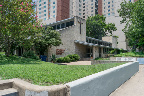
O'Neil Ford was one of the seminal Texas architects of the 20th century. So many architects speak of him with a sort of wistful admiration and profound respect. Authors credit his early career as instrumental in defining a southwestern regional architecture through Works Progress Administration and Civilian Conservation Corps projects: the Little Chapel in the Woods in Denton and La Villita in San Antonio. Ford Powell Carson continues to work in that tradition.
Part of the appeal of his architecture embodies the desire for authenticity and place-making; its authenticity is even more desirable because it comes from the constructive making of place and not reactionary thinking about architecture.
I contrast this with the Louis Kahn presented as exemplifying realness in Michael Benedikt's For an Architecture of Reality, an expression of the reactionary desire for realness. This Kahn succeeded in "designing egolessly" "form without rhetoric"—debatable, but what is most striking is that the reality of O'Neil Ford's buildings are not in this heroic cultural class. Rather, they belong more to the examples without attributions: the Mexican churches, the Texas community halls.
Materiality, as one component of realness, contributes to the humility in rough (yet soft?) brick, simple wooden assemblies and hand-made tiles.
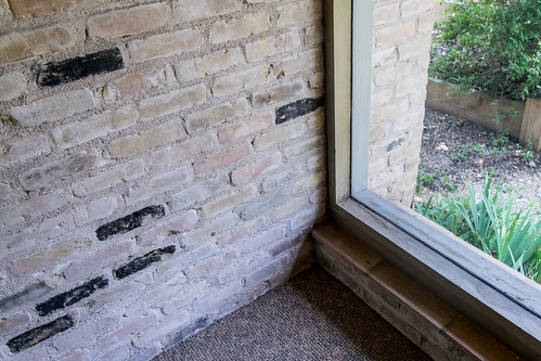
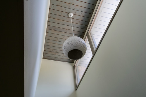
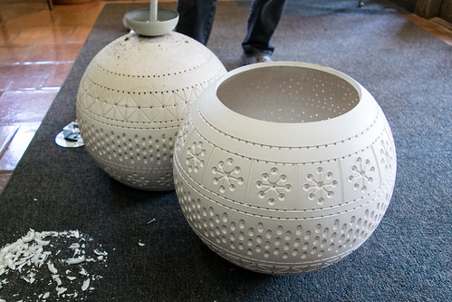
O'Neil Ford buildings have an artisan character enhanced by the integration of regional crafts. Many buildings feature his brother Lynn Ford's hand-carved doors or wood panels and the distinctive ceramic light fixtures designed by Martha Mood and fabricated by Beaumont Mood. The patterned globes at the University Lutheran Center were distinctive for their unglazed finish.
Here are the fixtures up close as they were being removed and salvaged.
In Ford's religious buildings, artisans contributed to the liturgical artifacts and devotional objects. University Lutheran Center had an altar of rustic wood supports topped by a fossiliferous limestone mensa. When I visited this week, many of the fixtures were arrayed on the altar with price tags (the altar had been marked sold by the time I visited; it is remaining with the Center and may be incorporated into the new building in some way).
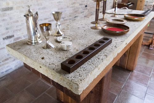
Without long discussion about the distinctions of artwork / artifact / handicraft / craftwork for liturgical objects, this architecture achieves a fulfillment of the symbiotic relationship between objects and buildings that is possible in the holistic consideration of the material culture of worship. I do not know how many of the ritual objects or furnishings are original; they appear well-made, but not particularly remarkable in themselves—more craft than art, if we permit the problematic distinction. But in the context of a building that is itself arguably more craft than art—and impeccably crafted at that—the elemental and rustic are elevated and transfigured. Is that not a proper image of the eucharistic life of the church? By contrast, the problem with so many contemporary liturgical artifacts is not necessarily their form, but their thinness of their mechanical manufacture and their disassociation with the environments they inhabit, which are also thinly and mechanically built. It takes the whole of the environment shaping the words and actions of their use to enact transfiguration.
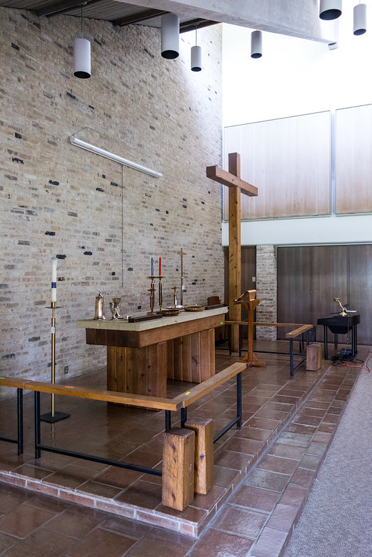
The value of craft in the architecture of O'Neil Ford seems to have been attached to an attitude to making beyond the material and artifact. There is an obvious affinity with the English Arts and Crafts Movement in the careful assembly of buildings and integration of art and space, but he extended the hands-on collaborative approach into the realm of building systems technology. He collaborated with Félix Candela in the engineer's forward-looking structural expressionism in thin-shell concrete. Later he contributed to the development of the lift-slab building system, an innovative method of pre-casting concrete floor plates on site and then lifting them into place. The synthesis of these modes of craft and technological production further establishes his place in the wider history of modern architecture. Among his religious architecture, First Christian Church of Denton most exemplifies this synthesis, though even here the drama of Candela's hyperbolic parabaloids fit within the volumetric profile of the vernacular country church.
But the University Lutheran Center is an example of O'Neil Ford and the Ford Powell Carson studio at their most humble. [Boone Powell appears to have been the project manager/lead for this project.] Perhaps that contributes to its obscurity in the literature. It certainly contributed to my own neglect. I know I had professors at UT commend it to me, but they went unheeded because it did not match my expectations of features that would suggest good modern church design. Its humility, along with its siting, may have contributed to it being overlooked, devalued and ultimately replaced.
It might be easy to dismiss as one of those 1970s churches with angular roof and rough walls, but within its humility is a finely-tuned quality. There is quiet intentionality in every component. In addition to the exquisite craft of the building, its organization and structure contribute the place-making. It feels villagey, especially as I have now experienced more of the types of villages that appealed to its designers. And what better quality for a place whose entire purpose is to continuously and intentionally build community?
The clients for this building were not designing a church in the typical parochial sense. The function of the building includes that of a church, but it is a particular type of community as a student ministry. They were building a church focused on a single phase in a person's spiritual life where personal formation—a bildungsroman in brick. Furthermore, the entire population turns over every four years, so there is always a greater consciousness of this activity of building community.
The building is shared by the ELCA and LCMS, the two largest Lutheran denominations in the US which are not in mutual fellowship/communion based on what are now seen as major differences. (I have not confirmed if it was built for this shared arrangement, though the layout of the offices suggests it was. UPDATE: This arrangement was original; in fact, the ministry of the denomination that became the ELCA built what is now the Baptist Student Ministry just up the street but moved into this shared building a few years later. The co-location will continue in the new space but with more clearly defined distinctions between spaces.)
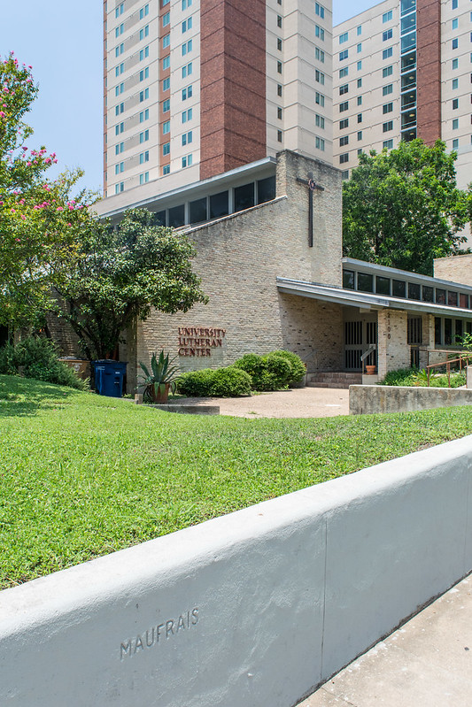
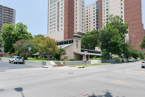
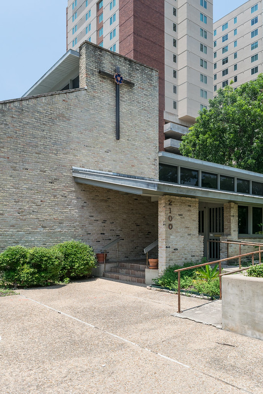
From the street, the most defining characteristic of the building is its relationship to the ground. While the site rises upward from three feet above street level at the corner, the floor level remains close to street level. The building has been described as 'buried' and a 'bunker,' but I think that is actually backwards. It is the earth that envelops the building as the ground rises around it, to the point that the back alley has direct access to rooftop parking.
The windows on the right in the picture below are the ones shown below in the classroom with blue walls. The ceiling level of the inhabited portion of those rooms is actually below the lower sill of those windows.
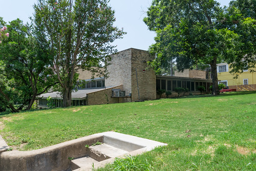
The elevated ground plane defines the approach to the center in an intangible way. Walking from the public sidewalk into the front plaza, you are suddenly on the inside of an unexpectedly defined place, and your perspective on the site shifts dramatically. The building suddenly presents an entrance which from the sidewalk was difficult to recognize. A tiny horizontal movement with no walls, portal, or vertical change produces an experientially immense threshold. It is like walking into an embrace.
Most of the windows rise in long towers above the ground, but on the south side, a terraced garden gives access to light and view through clear vision glazing along the side wall of the sanctuary.
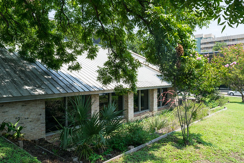
The proliferation of glass planes as a dominant motif in modern architecture—from the Crystal Palace via the International Style—never gained significant traction in religious architecture. Eye level glazing would seem to contradict the internality and focus associated with religious functions. And yet the desires for unbroken space or a connection to nature/outdoors also appeal to religious expression, and architects continue to attempt it: most famously in Tadao Ando's Church on the Water to versions published recently on ArchDaily in Colombia or in Edinburgh.
It was an idea that Ford previously explored in Denton's First Christian Church and came back to in the Episcopal Church of Reconciliation in San Antonio. In the latter, the view on three sides open to three clearly defined courtyards. Long overhangs to shade the glazing and impossibly small flush sills dissolve the sanctuary, but only as far as the firm enclosure of each precinct outside. While the examples given above attempt to place the opening on the focal wall, Ford's designs only open the perimeter of the nave. In the University Lutheran Center, the asymmetrical section places a glazed wall on one side (at the same time dissolving the connection of the major roof element to the wall).
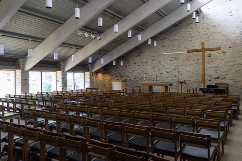
Daylight provides the organization strategy of the whole building. Three distinct functions occupy three wings organized by linear light wells: the church in the south, offices to the east (facing the street), and classrooms to the north. The quality of light afforded by their orientation are appropriate to the functions
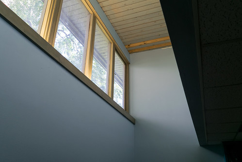
A fourth space, a large gathering area sits in the center of the bars (below the parking surface). This room opens to sanctuary by operable partitions which are actual solid doors in this case, not flimsy accordion partitions that would have ruined the realness of the sanctuary. This area also contains the restrooms, kitchen, and storage areas that have the least need for access to natural light.
The Daylighting is impeccable in the chapel. All of these photos were taken with the overhead lights off. The nave had an impressive balance between an even diffuse level of lighting (functional for reading and quite comfortable) and still an element of dramatic lighting effects celebrated in modern churches where the structural glulam beams dissolve into the light-filled peak.
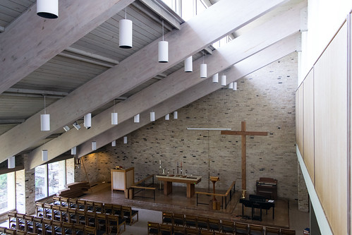
I want to contrast it to the Lewerentz churches, which are resplendent with small yet heroic tectonic details that draw attention to themselves and celebrate the architecture. This church is not awe-inspiring, but is that the only measure of a successful or significant building?
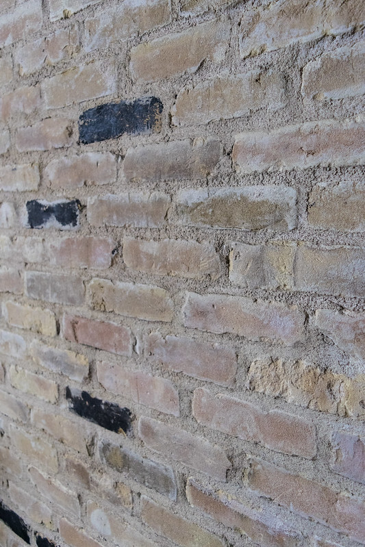
We need more active meekness in architecture, something between the passive and the heroic. The University Lutheran Center demonstrates the potential for architectural humility elevated by work, craft, and material into an architecture that is first good; and because it is good and visible, it is beautiful.
